

The client asks for content that feels “authentic, warm, and premium.” You picture a creator filming a quiet morning routine. They picture a glossy product shoot. Both interpretations fit the words, and you only discover the difference after the first edits arrive.
Learning how to make a moodboard online gives you a way to resolve those choices before production. For a freelance marketer, it can explain a proposal. For an agency, it can connect the strategist's brief to the creative team's work. For a content creator, it can become a practical guide to framing, lighting, and editing.
This walkthrough uses a fictional independent coffee brand and a campaign called “Make room for a pause.” The visuals are AI-generated illustrations of the proposed direction, not a real client campaign or product screenshots.
How to make a moodboard online: the quick version
Write a short campaign brief, collect references that answer specific creative questions, and arrange them into one coherent direction. Annotate the choices, review them with whoever approves the work, then turn the board into a shot list and layout rules.
Your finished board should help someone decide what to make next: which light to use, what belongs in the frame, how the product appears, and where the message goes.
By the end of this walkthrough, you will have a campaign brief, an annotated direction, a feedback record, and a starting production plan. You can use the same process for a service business, a creator partnership, or a product launch by changing the audience, offer, and deliverables.
What a campaign moodboard needs to resolve
A marketing moodboard connects a message to its execution. If the message is “a coffee worth slowing down for,” the board needs to show what slowing down looks like: a recognizable action, a deliberate frame, and enough time for the viewer to understand the moment.
Different people need different answers from the same board:
| Your role | The question the board should answer | What to hand over |
|---|---|---|
| Freelance marketer | Will the client agree to this creative approach before I produce the assets? | One recommended direction, its rationale, and the decisions requiring approval |
| Marketing agency | Can strategy, design, account management, and production interpret the brief consistently? | Annotated references, format requirements, approved assets, and one decision owner |
| Content creator | What do I need to film or photograph, and how should it feel? | A visual direction, shot list, props, framing notes, and examples of what to avoid |
Keep the scope clear. A moodboard establishes a direction; a storyboard specifies a sequence of shots; a content calendar assigns topics and publishing dates. For this coffee campaign, the board comes first, then the video shot list and carousel outline, then the publishing schedule.
You may only need a small board for a recurring series with established styling. A new client, unfamiliar product, or several production partners will usually need more explanation. Add detail where people could make different decisions from the same reference.
1. Start with the campaign decision
Before collecting images, write down the audience, message, deliverables, and constraints. Keep the brief visible beside the references.
Here is our example:
| Brief element | Campaign decision |
|---|---|
| Audience | People working from home who enjoy making coffee |
| Message | Make space for a small, enjoyable break in your day |
| Desired action | Explore the brand's coffee range |
| Deliverables | One short vertical video, a three-slide carousel, and a product-led social image |
| Feeling | Familiar, calm, inviting |
| Production constraints | One apartment location, window light, one adult participant |
| Avoid | Luxury café styling, frantic edits, cluttered desks, wellness promises |
These constraints give the references a job. A dramatic café interior might be beautiful, but it does not help someone shoot this campaign in an apartment.
If you are working with an existing brand, bring its approved packaging, colors, and typography into the brief. A campaign moodboard should explain how you will use those assets.
Separate fixed requirements from creative choices
Mark what is already decided. Product appearance, approved claims, the offer, and essential brand assets belong in the fixed requirements. Lighting, setting, framing, transitions, and prop choices may still be open for exploration.
For our fictional brand, cobalt and cream are proposed campaign colors. With a real client, we would check those against the brand kit before making them central to the concept. That prevents a beautiful reference from silently becoming an unapproved rebrand.
Write one sentence linking the look to the audience: “Use a familiar home coffee ritual so someone working from home can recognize a moment they could recreate.” This is a creative hypothesis to explore, not a claim that the campaign will convert.
Copy this brief into your board
Campaign: What are we making, and why now?
Audience: Who is this for, and what situation are they in?
Message: What single idea should they remember?
Action: What should they do next?
Deliverables: Which images, videos, and layouts are required?
Fixed requirements: What must stay accurate or unchanged?
Creative choices: What do we need this board to resolve?
Constraints: What time, location, people, and assets are available?
Decision owner: Who approves the direction, and by when?
2. Set up a board around the work you need to make
Create four clearly labeled areas in your online workspace: brief, references, decisions, and deliverables. Leave room beside each image for a sentence explaining why it belongs.
Put exploratory material in a separate area so your presentation stays easy to follow. Label the selected direction and its version, such as “Make room for a pause — v1.”
The Quickmake moodboard workspace is one place to develop a visual direction. If you are still choosing your setup, the moodboard tools comparison explains different workflows.
Arrange the board in a reading order: the brief explains the assignment, the references show the proposed approach, and the decisions explain what to do with it. Give the dominant reference more space than supporting details. A viewer should understand the direction before zooming in to read every note.
Keep a source link or asset name with each reference. When the work moves to production, the designer should be able to find the original image, the creator should know which approved product photo to use, and the account manager should be able to distinguish an inspiration image from a deliverable.
For client presentations, prepare a focused view of the selected direction. Keep discarded options available in your working area without asking the client to interpret the entire research process.
3. Gather references for specific creative choices
Look for material that answers the questions your production team will face.
| Reference type | What it should clarify | Our coffee campaign |
|---|---|---|
| Photography | Lighting, framing, and setting | Window light in a lived-in apartment |
| Human behavior | What the person does on camera | Pour, pause, take a sip |
| Product | How the product appears in the scene | Coffee and packaging within an everyday ritual |
| Color | What connects the assets visually | Cobalt accents, cream surfaces, espresso tones |
| Typography and layout | How the message sits alongside imagery | One clear headline with space around it |
| Motion and sound | How a video should feel | Unhurried actions, a clear pour, room for ambient sound |
For motion references, note the specific moment that matters: “Opening close-up establishes the action before the wider shot.” A still image cannot communicate timing on its own.
Use existing campaign work as a reference for particular qualities, and record the original source. Add your own photos, licensed references, or generated concepts where useful. Label generated imagery so collaborators understand which scenes still need to be produced or checked against the real product.
Search for qualities you can describe
Broad searches such as “coffee aesthetic” can leave you with a collection of attractive but unrelated images. Break the brief into smaller questions and search for concrete qualities: “coffee pour side window light,” “home coffee routine close-up,” or “product photo negative space.”
Collect outside your category when the reference solves a specific problem. A skincare image may demonstrate useful empty space; a travel video may show an effective transition from a detail to a wider scene. Annotate the quality you want so the team does not accidentally borrow the unrelated product story.
Start with a bounded collection session, then inspect the gaps. If you have six lighting references and no example of how the headline will fit, stop collecting lighting references. Find or make a composition study instead.
Use AI to explore a missing scene
When you cannot find the right combination of action, setting, and copy space, a generated image can make the proposal concrete. Specify the production decision in the prompt:
Editorial photograph of an adult pouring coffee from a glass carafe into a cobalt ceramic mug in a contemporary apartment kitchen. Warm side window light, cream counter, natural hands and posture. Leave uncluttered wall space above the action for a headline. No text or logos. This is a composition reference for a social campaign.
Review the result against the brief. Check hands, pouring physics, shadows, product details, and whether the scene is achievable. If you generate several references, repeat the agreed palette, light, and setting so each image belongs to the same direction. Keep headline text editable when building the actual layout.

Generated photography reference: the window light establishes the mood, the pour gives the video a simple action, and the clear upper area leaves room to explore a headline.
4. Curate one direction that works across formats
Ask of every reference: What decision does this help us make? Remove duplicates and images that pull the campaign toward a different feeling.
For this example, we would remove a dark, theatrical espresso shot because it conflicts with the everyday daylight setting. We would also remove a crowded tabletop image because the campaign needs space for copy.
Use as many references as the decisions require. A compact board with a clear reason for each image is easier to review than a large collection with no explanation.
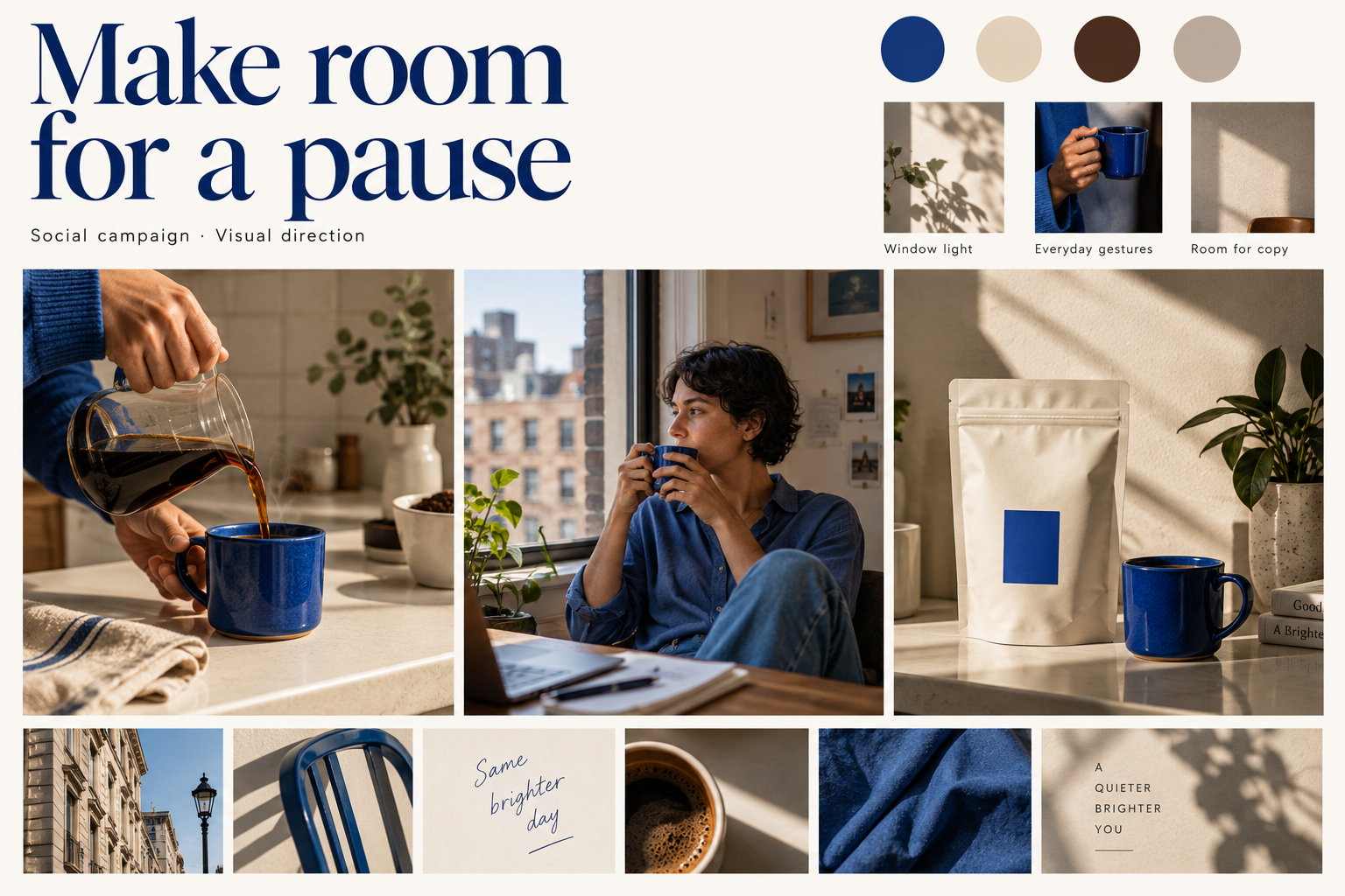
AI-generated direction study for our fictional coffee campaign. It shows the intended relationship between imagery, color, and message; the packaging and decorative copy are illustrative.
Check whether the direction can support the whole assignment. A product close-up may work for a static post, but the creator also needs a setting and a sequence of actions for the video.
Use a selection checklist
Evaluate each candidate with four questions:
- Relevance: Does it support the audience and message in the brief?
- Specificity: Can you name the decision it helps make?
- Compatibility: Does it belong with the other selected references?
- Feasibility: Can you produce or adapt this idea within the constraints?
If an image is valuable but fails feasibility, label it as a stretch reference and explain the achievable substitute. A sunlit loft may communicate the right light, while your actual plan uses one window and a tighter crop.
Try a contradiction check before presenting: read two annotations together. “Quiet, unhurried action” and “rapid cuts throughout” ask the editor to follow conflicting directions. Resolve the conflict or clearly assign the treatments to different deliverables.
Use separate boards when the strategic routes really differ. A calm home ritual and an energetic commute campaign tell different stories. Present the choice in those terms, with its production implications. You do not need three directions for every assignment; the number should match the decisions still open.
5. Annotate what to take from each reference
“Love this” leaves the next person guessing. Explain the quality you want to carry into production and its limits.
| Vague note | Useful annotation |
|---|---|
| Make it authentic | Show a recognizable coffee-making action in a real-looking kitchen; avoid posed cheers toward camera |
| Nice colors | Repeat the cobalt accent in a prop or wardrobe item while keeping the background quiet |
| Use this composition | Leave clear wall space above the action for a short headline; check the actual crop before shooting |
| Premium feel | Keep product details readable and props deliberate; retain the everyday apartment setting |
For an agency, these notes connect strategy to the production brief. For a freelancer, they explain the reasoning behind the proposal. For a creator, they become instructions you can check while setting up the camera.
Write annotations as observation, instruction, and limit
For the coffee-pour reference, an annotation could read:
Observation: Side light separates the mug from the background and makes the pour easy to see.
Instruction: Place the camera where the stream and mug remain visible; keep the upper frame simple enough for copy.
Limit: Use the client's approved product and available kitchen. The generated mug and room are references.
This structure is useful when one person collects references and someone else produces the work. It records what matters and gives the maker room to solve the scene in practice.
Add an anti-reference only when it clarifies a likely misunderstanding. For this campaign, you might label a dramatic dark studio shot: “Avoid this lighting treatment; we want the audience to recognize an everyday home setting.” Explain the excluded quality rather than criticizing another creator's work.
6. Review the choices before making the full campaign
Present the brief first, then the board, then the decisions you need. Ask specific questions:
- Does this setting feel familiar to the intended audience?
- Should the person or the product lead the opening image?
- Which reference feels least consistent with the brand, and why?
- Can we produce this direction with the available location, props, and time?
Record the outcome beside the board. For example: “Proceed with window light and cobalt accents. Make the product more prominent in the static post. Confirm actual packaging before production.” This is illustrative feedback for our fictional brief.
If you work alone, review the board against the same questions. If several people approve the campaign, identify who resolves conflicting feedback.
Agreement on this direction covers its visual choices. Copy, product accuracy, and final executions still need their own review.
Keep feedback tied to a decision
You can use “keep, change, question” to structure comments. Ask reviewers to name the reference and the reason for their reaction. “Change the blue” needs a follow-up: is blue outside the brand palette, too dominant, or simply a personal preference?
| Feedback | Useful follow-up | Decision to record |
|---|---|---|
| It feels too slow | Is the concern the opening action, the edit pace, or the calm setting? | Keep the setting; test an opening close-up that establishes the action sooner |
| Make it more branded | Which approved brand element is missing? | Use the actual pack prominently in the product post |
| This looks too polished | Is the light, styling, or performance creating that impression? | Keep window light; reduce props and use a natural gesture |
| Can we do another direction? | What requirement does this direction fail to meet? | Revisit the relevant brief item before collecting more images |
These are illustrative decisions, not results from a client test. They show how feedback becomes a specific revision instead of a vague request to “try something else.”
Record the approver, date, selected version, and unresolved items. After revisions, preserve the previous version and summarize what changed. For an agency, assign one person to consolidate comments so the creator receives a coherent brief.
7. Turn the moodboard into a production brief
Extract a few rules that apply across the deliverables:
- Use window light and warm neutral backgrounds.
- Carry a cobalt accent through the scenes without changing approved brand assets.
- Show a simple coffee ritual through recognizable actions.
- Plan clear space for text and check each intended crop.
- Keep the product visible enough to connect the mood to the offer.
Then write down what to make:
| Deliverable | Starting execution | Check before production |
|---|---|---|
| Short vertical video | Close-up of the pour, wider view of the pause, product ending | Can the action read clearly, and is there room for captions? |
| Three-slide carousel | Introduce the moment, show the ritual, finish with the offer | Does each slide advance the idea and remain readable on a phone? |
| Product-led image | Actual pack beside the mug, with one short headline | Is the packaging accurate and the product easy to recognize? |
Make one rough frame or layout before producing every variation. If the chosen references do not translate into a usable composition, revise the direction while the work is still small.
You can carry the visual decisions into the design editor when you start composing the campaign.
A worked shot list for the coffee video
The moodboard suggests three visual ideas: a visible pour, a recognizable pause, and a connection to the product. A starting shot list could be:
| Shot | Action and framing | Why it belongs | What to capture |
|---|---|---|---|
| Pour | Close view of coffee entering the mug | Establishes the ritual through an immediately legible action | Several clean takes with the mug and stream visible |
| Pause | Wider view of the participant taking a sip by the window | Connects the detail to the campaign's everyday setting | A natural gesture, with enough space around the person for reframing |
| Product | Approved pack beside the mug | Connects the scene to the item being promoted | Clear product details and a composition that accommodates the CTA |
Capture a little stillness before and after each action to give the editor options. Record a clean pour sound separately if it is part of the idea. Check the intended frame on location instead of assuming a wide shot can always be cropped later.
For a creator working alone, mark which shots need a fixed camera and which can be handheld. For an agency shoot, assign props, product preparation, and continuity checks before the session. Those decisions turn a visual concept into work someone can schedule.
Translate the same idea into a carousel
The carousel needs a progression, not three nearly identical coffee photographs. A draft sequence might be:
- Introduce the moment: “Make room for a pause,” supported by a simple ritual image.
- Develop the idea: Show the pour or preparation detail with a short, approved message.
- Connect to the offer: Show the actual product, the relevant offer, and a clear next action.
Keep the visual relationship through color, light, type, and spacing. Give each slide a distinct job. Review the text at a realistic phone size and check that the product details remain recognizable.
Before handing off, separate confirmed decisions from open questions. “Window light approved; final offer copy pending” is more useful than a board labeled “final” while essential decisions remain unresolved.
A practical first-session workflow
If you need a starting schedule, try the following 90-minute working session. These are planning allowances, not a promise about how long every campaign should take; client feedback and production happen afterward.
| Time | Task | Output |
|---|---|---|
| 0–15 minutes | Clarify audience, message, formats, and constraints | A brief with the open creative decisions identified |
| 15–35 minutes | Gather or generate references for those decisions | A small working collection with source notes |
| 35–50 minutes | Cull contradictions and group the selected references | One named direction |
| 50–65 minutes | Annotate light, behavior, framing, and copy space | A board someone else can interpret |
| 65–80 minutes | Sketch a frame or layout for each deliverable | Evidence that the direction can translate into content |
| 80–90 minutes | Check the brief and prepare review questions | A focused presentation with explicit decisions requested |
If you get stuck, identify the missing input. More image collecting will not resolve an unclear offer or conflicting audience definitions. Return to the brief, record the question, and ask the person who owns that decision.
Check the board before handing it over
Use this checklist with the creator, designer, or client who will act on the board:
- The audience, message, action, and required deliverables are visible.
- Every selected reference explains a creative choice.
- Fixed brand requirements are distinguishable from proposed ideas.
- Generated concepts and real product assets are labeled.
- The lighting, setting, people, and props fit the production resources.
- Still-image references cover framing and text placement; video guidance covers action and pacing.
- There is a rough plan for each deliverable, including the product and CTA.
- The selected version, decision owner, revisions, and unresolved questions are recorded.
Finally, ask the person making the content to describe the first asset they would create. If their interpretation differs from yours, revise the relevant note or reference. This is a useful way to discover ambiguity while it is still inexpensive to resolve.
Keep the board available during production. Compare the first rough cut or layout against its rules, and update it when you deliberately change direction. At the end of the campaign, note which references helped and which created confusion so the next brief starts with better examples.
Common mistakes to catch early
Collecting only finished ads. Add lighting, gesture, setting, and composition references so the team can see how to build the scene.
Mixing incompatible directions. Separate genuinely different routes and explain the tradeoff before choosing one.
Treating AI packaging as the real product. Use the approved pack artwork or actual product photography when building final promotional assets.
Assuming a strong mood predicts performance. A moodboard helps align creative decisions. Campaign results still depend on the message, offer, audience, execution, and distribution.
Approving the board without a next step. Finish the review with a named direction, recorded revisions, and a first production task.
Frequently asked questions
What should a marketing moodboard include?
Include the campaign brief, imagery, color and typography direction, layout references, and notes explaining the choices. For video, add references or descriptions for movement, pacing, and sound. Finish with the deliverables those decisions need to support.
Can I use the same moodboard for social posts and video?
Yes, when they share a campaign direction. Keep the visual rules together, then add format-specific guidance: framing and copy space for stills, actions and timing for video. Check that the examples cover both.
How is a moodboard different from a content calendar?
A moodboard explains how the content should look and feel. A content calendar organizes what will be published and when. The moodboard can guide several pieces scheduled in the calendar.
Can AI generate the references for a moodboard?
Yes. Generated concepts can help explore a scene, lighting direction, or composition. Label them, review their details, and check their feasibility. Use accurate brand and product assets when moving into final campaign work.
Start with one campaign decision you need to resolve. Open Quickmake, put your brief beside a few references, and write what each one should change about the content you make.